This post was inspired by the RA video on the new GM, sorry, gm, logo. Just the latest in a long line of woeful corporate re-brands. It reminded me of an early and especially egregious example from the UK. One that cost a lot of money and generated much embarrassment. Ladies, gentlemen, I give you…
The Utopia Project
Growing up in Southall, west London, in the ‘70s and ‘80’s we were less than three miles from Heathrow airport. When planes flew over they were low, not specks up in the sky, but big beasts, clearly visible. We naturally took interest in the planes, how they looked and sounded. We noted how noisy the Soviet Aeroflot planes were, how manky and ramshackle many planes from less developed countries looked. Of course, as a patriotic British kid I took pride in the smart livery of the many British Airways craft in the sky.

Naturally, anything that inspired such feelings and flew the British flag around the world had to go. In 1997, the year Tony B. Liar became PM of course, Britain’s national carrier, British Airways (BA) came up with the Utopia Project. The old, stylised Union Flag livery was deemed to convey “an air of arrogance and detachment” (well d’uh, we’re British, “arrogance and detachment” is what we do). The Chief Executive Robert Ayling declared that BA needed “a corporate identity that will enable [it] to become not just a UK carrier, but a global airline that is based in Britain” and the airline should better reflect the international image of the UK as “friendly, diverse and open to other cultures.”
I’ll wait while you facepalm.
Get ready, you may facepalm again, it gets worse.
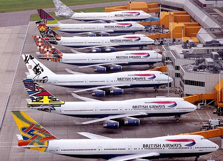
The old livery, which was known around the world and represented one of the world’s great airlines, was to be replaced not just with a new, inclusive and diverse design. No, just ONE design would not be diverse enough. Artists from Britain and around thew world were asked to come up with designs and the Utopia tailfins numbered thirty-four completely different designs in total. Several of those designs only appeared on one aircraft, most were on eight to twelve or so, some on more than twenty. So, an instantly recognisable livery was replaced with, effectively nothing. Here is a small sample of the designs.

- Youm al-Suq (Market Day) by Shadia Alem. Evocative of the life in an Arab market. Painted on one aircraft.
- Kg’oocoan heé naka hìian theé e (Animals and Trees) by Cg’ose Ntcox’o. Seven jackals at and oasis in the Kalahari Desert, Botswana. Appeared on eight aircraft.
- 约会 (Rendezvous) by Yip Man-Yam. Chinese calligraphy of a poem describing water boiling. Twenty-two aircraft.
- Whale Rider, by Joe David. From wood carving representing the whaling tradition of the Tla-o-qui-aht people of Vancouver Island. Three aircraft.
- Waves of the City by Jenifer Kobylarz. A modern abstract intended to “convey a sense of frozen motion.”. Painted on thirteen aircraft flying to the US.
- Chelsea Rose by Pierce Casey. An evocation of the English rose based on the artist’s visits to gardens in Chelsea and Battersea. Twenty-three aircraft.
There were designs inspired by England, Scotland and Ireland (but not Wales, oddly for a project dedicated to inclusivity) and from nations and cultures from every continent except Antarctica and (again, oddly) South America. Of course, those who criticised the Utopia tailfins were denounced as racists and fuddy-duddy old stick in the muds who couldn’t see how brave and expressive it all was.
Nevertheless, the new designs did come in for criticism, heavy criticism, and not just from crusty old retired colonels. They attracted flack from the right, the left and sensible folk with no political affiliation but plenty of common sense.
Naturally, patriots did object to the national flag carrier airline not actually carrying the flag. Margaret Thatcher said, “We fly the British flag, not these awful things”. She also covered up the tailfin on a model 747 with Animals and Trees on it with her handkerchief rather than look at it. The Guardian’s design critic said the project was “muddle-headed and messy – ethnic designs turned into the equivalent of doll’s-house wallpaper, things applied but not belonging.” And compared it to a patronising collection of “native” artefacts from the Imperial era.
A criticism from a across a broad spectrum was the complete lack of a cohesive visual identity. You see a plane with a colourful, unfamiliar tailfin in the air or on the tarmac, is it BA or from some tiny carrier out of one of ex-Soviets ‘stans? Who knows? Purely from a business/marketing point of view having your aircraft looking as of they belong to a variety of obscure carriers seems an odd decision. It might have made the BA high ups feel “global and caring” but it didn’t make British people and BA staff feel caring about BA high ups. The new designs were mocked mercilessly.
BA flight crew referred to themselves as working for “Zulu Air” and the British public borrowed the nickname for NASA’s weightlessness training aircraft, referring to the Utopia planes as “vomit comets”. Virgin Atlantic took cheeky advantage of the situation by putting Union Flags on their aircraft and adopting the slogan “Britain’s national flagcarrier”.
Sheer weight of ridicule meant that the £60 million project lasted less than two years and only about half of BA’s aircraft ever got their diverse makeover. In 1999 it was announced that a variation of the design originally intended just for Concorde – known as Chatham Dockyard Union Flag, essentially a wavy version of the original BA tailfin – would be adopted for the rest of the fleet. The last vomit comet left the skies in 2006. Today £60 million would be more than £92 million, or $125 million.

While checking facts for this post I came across something that really summed up how patronising and tokenistic the Utopia project, and the whole attitude it exemplifies, really are. Of the £60 million Utopia cost, £2 million went to the design agency, Newell & Sorrell, and the artists. Let’s assume Newell & Sorrell took half, that leaves a cool million to split between thirty-four artists, just short of £30,000 each. Cg’ose Ntcox’o, the Botswanan artist who painted Animals and Trees received the equivalent of a little over £600. I’m betting Pierce Casey and Jennifer Kobylarz recieved rather more. It’s true, £600 goes a long way in Botswana, it costs more to live in New York like Jennifer Kobylarz does. I’m sure the oh so inclusive and compassionate BA execs, right on designers and trendy artists in the UK, USA and Australia reminded themselves of this as they banked their much bigger cheques.
6 replies on “A tale about tails”
Wow! Just, wow! I can’t believe I didn’t follow this at the time. What an amazing cluster _ _ _ _ . Nice to know that the lack of knowledge of the purpose of a logo is not solely an American thing. And that predates Boaty McBoatface by 20 years.
The only thing that would make this story better is if #3, the Chinese Calligraphy, didn’t translate in to what they thought. Every time I see some young pseudo-tough with Chinese writing on his arm, I am pretty sure it really means something like Kick Me.
I know what you mean. As folly goes it does have a certain majesty doesn’t it?
I did wonder if the Chinese poem about water boiling is, in fact, about the water slowly coming to the boil that the frog is in.
Dare I mention Consignia?
https://i.imgur.com/bZuOecj.jpg
LOL, I’d forgotten Consignia.
If the effects of Consignia last for more than four hours should I contact my physician?
You’re not a war time Consignia, Tom