Statistics on Jabbed versus UNJabbed in Canada courtesy of Alex Berenson.
Stunning data about vaccine failure from Ontario, Canada (substack.com)
| 16 min ago | 49 |
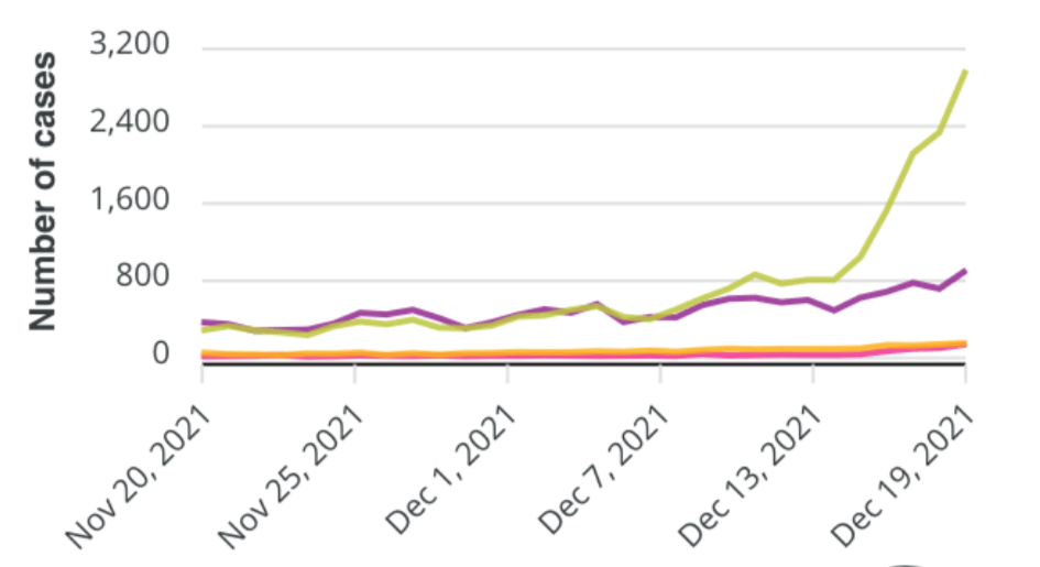
Them thar green line is infections among the vaccinated. Assuming these are Omicron cases, there are only two possibilities:
The vaccines have now failed completely.
Omicron preferentially infects vaccinated people.
Hey, why not both?
SOURCE: https://covid-19.ontario.ca/data

8 replies on “Stunning data about vaccine failure from Ontario, Canada”
Now, all of these case data are irrelevant when one considers the ONLY important data point that should be considered and is too often ignored:
How many are dying/dead as a direct result of the virus?
So, I went to discover this data for myself (cuz data verification is what people like me regularly do), and the plot that Linda copied above is found at https://covid-19.ontario.ca/data (you have to scroll a bit). Today’s version of the same plot looks like this for “All Time” since August:
Here are the caveats for this data:
Ontario is a big place with the largest fraction of the Canadian population (13,448,49438.26%) by province/territory — according to Wikipedia. No one should ever be able to convince anyone that the current spread is due to a lack a of acceptance of the experimental drugs, since 81.1% of Ontarians aged 5 or older in 2021 are “fully- vaccinated”.
I merely presented what Alex Berenson presented. I included his link.
Did you see the link? This is from Alex Berenson’s Substack site. Take it up with Alex Berenson if you believe he misrepresented the data.
Stunning data about vaccine failure from Ontario, Canada (substack.com)
My point was not one of disbelief. Please calm down and don’t take my commentary as one of confrontation. This is an open discussion about data — not the authors.
One of the additional pieces of information that I have gleaned from this Canadian data set is that the policy makers use this data to lie to the public (no surpirse). Consider the defaul version of that plot that shows a case rate instead of the absolute case counts (plot below). If one just looks at the case rate, then one will conclude that the “unvaccinated” people have a greater risk. Unfortunately, this masks the truth that the opposite is true.
I look forward to your book.
Let us know when it’s available.
What’s the title?
😀 Funny. If only I were motivated to create such a thing…. I have always preferred open, real-time discussions like this one.